Excel is an incredibly versatile tool, but its built-in charting options are limited when it comes to geospatial data visualization. Thankfully, with Python, you can tap into powerful libraries like Folium to create interactive geospatial plots in Excel. By integrating Python into Excel with PyXLL, you can seamlessly bring these visualizations into your spreadsheets.
In this post, we’ll explore how to use Folium, Python, and PyXLL to create and display geospatial maps directly in Excel.
Why Folium?
Folium is a Python library built on the popular Leaflet.js framework. It allows you to create beautiful and interactive maps with minimal code. From simple point plotting to complex choropleth maps, Folium makes geospatial data accessible and visually stunning.
By embedding these maps into Excel using PyXLL, you can deliver geospatial insights in a tool familiar to almost everyone—no need for additional software installations.
Setting Up Your Environment
To get started, you’ll need:
- Python installed with the following libraries:
foliumpandas(for handling geospatial data)pyxll
- PyXLL installed and configured in Excel.
PyXLL lets you call Python functions directly from Excel and return results, including images, charts, or even interactive HTML content.
See https://www.pyxll.com/docs/userguide/installation/firsttime.html for details of how to install PyXLL.
I also recommend using a Python code editor such as VS Code to help write Python code, but any text editor will do.
Step 1: Create a Basic Folium Map
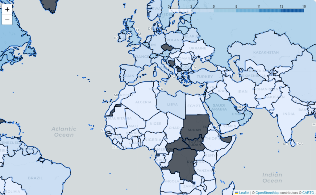
Here’s a simple Python script to generate a map using Folium. The code first loads a CSV file containing a value for the ecological footprint for each country, creates a map using data from geojson.xyz, adds a choropleth layer to the map, and finally saves the map as an html file.
import folium
import pandas as pd

eco_footprints = pd.read_csv("footprint.csv")

political_countries_url = (
    "http://geojson.xyz/naturalearth-3.3.0/ne_50m_admin_0_countries.geojson"
)

m = folium.Map(location=(30, 10), zoom_start=3, tiles="cartodb positron")
folium.GeoJson(political_countries_url).add_to(m)

folium.Choropleth(
    geo_data=political_countries_url,
    data=eco_footprints,
    columns=["Country/region", "Ecological footprint"],
    key_on="feature.properties.name",
).add_to(m)

m.save("footprint.html")
The CSV file contains the information as it’s currently shown on Wikipedia, which is based on data gathered by York University, the Footprint Data Foundation, and the Global Footprint Network.
The output file shows the data from the CSV file as a map.

Step 2: Embed the Map in Excel with PyXLL
PyXLL makes it easy to embed HTML maps directly into Excel as web views or static images. To display your Folium map in Excel, follow these steps:
- Write a Python function that generates the map.
- Create a “bridge” class so PyXLL can understand folium map objects.
- Call the function from Excel using PyXLL.
For the function that generates the map, instead of reading a CSV file we will pass in the data to the function. Since we’ll be calling this function from Excel that makes it much more flexible as the user of the function can pass in data directly from the Excel worksheet.
from pyxll import xl_func, plot
import folium
import pandas as pd


@xl_func
def plot_choropleth(data: pd.DataFrame,
                                 countries_column: str,
                                 values_column: str):

    political_countries_url = (
        "http://geojson.xyz/naturalearth-3.3.0/ne_50m_admin_0_countries.geojson"
    )

    m = folium.Map(location=(30, 10), zoom_start=3, tiles="cartodb positron")
    folium.GeoJson(political_countries_url).add_to(m)

    folium.Choropleth(
        geo_data=political_countries_url,
        data=data,
        columns=[countries_column, values_column],
        key_on="feature.properties.name",
    ).add_to(m)

    plot(m)

    return m
The code is the same as in the previous section, but instead of loading the data from a CSV file it now takes it as a pandas DataFrame argument.
The columns in the DataFrame containing the country names and the value we want to plot are also passed as arguments, allowing us to use the same function for different data sets more easily.
The function is decorated with the “@xl_func” decorator from the pyxll package. This tells the PyXLL add-in this function should be exposed to Excel and be callable as a worksheet function.
Rather than saving the map as an HTML file we use the “pyxll.plot” function to display the plot in Excel. However, as our code is written now this will not work as PyXLL won’t recognize the “folium.Map” object that we are passing to pyxll.plot.
Bridging PyXLL and Folium
In order for PyXLL to understand how to display a folium map we need to write what PyXLL calls a “plotting bridge”. This might sound complicated, but really it’s quite simple. The bridge class simply takes the object being plotted and provides a way of converting that to another format. In our case we can convert it to HTML using the “save” method we saw earlier.
from pyxll import xl_plot_bridge, PlotBridgeBase

# To display a plot of type 'folium.folium.Map' we need a custom bridge
# that handles exporting the map to an html file
@xl_plot_bridge("folium.folium.Map")
class FoliumBridge(PlotBridgeBase):

    def __init__(self, map):
        self.__map = map

    # PyXLL can use various different formats, but we are only interested in html
    def can_export(self, format):
        return format == "html"

    # PyXLL will call this to export the map object as an html file
    def export(self, width, height, dpi, format, filename, **kwargs):
        self.__map.save(filename)
The bridge class is registered using the “@xl_plot_bridge” decorator, and now any time we call “pyxll.plot” with a folium Map object this bridge class will be used to handle exporting it as html.
This code needs to be added to the list of modules imported by PyXLL by adding it to the “modules” setting in the pyxll.cfg file. It can in the same module as the “plot_choropleth” function written above, but I prefer to keep it in a separate module since it can be used by any functions using folium.
Calling the function and plotting our map in Excel
Now we have everything we need to test out our function in Excel!
If you’ve been following along, don’t forget to save your Python module (or modules) and add them to the “modules” setting in your pyxl.cfg file. You might also need to add the folder where you’ve saved your modules to the “pythonpath” setting.
With PyXLL configured to load our code, either start Excel or if you already have Excel running, select “Reload” from the PyXLL menu. Now you should have a new function “plot_choropleth” available to you as a worksheet function!

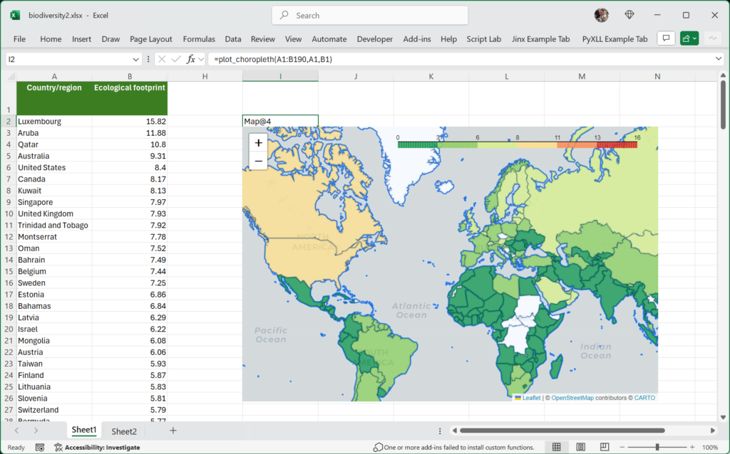
To call the function enter it into a cell in the worksheet, passing in the range of data as the first argument, the column header for the countries in the second, and the column header for the ecological footprint in the third.
The map is added to the Excel worksheet just below the function. It’s a fully interactive html map, not just a static image! I’ve added a little more formatting to the function, but this is still a fairly simple example of what you can do using folium in Excel.
All of the code used in this blog post, along with the spreadsheet, is available for you to download.
Enhancing the Workflow
Once you’ve mastered the basics, you can:
- Add dynamic layers such as heatmaps or GeoJSON overlays.
- Link maps to Excel data so they update dynamically based on cell values.
- Create interactive dashboards combining Excel’s strengths with Python’s geospatial libraries.
Conclusion
Integrating Folium maps into Excel with PyXLL transforms how you visualize and interact with geospatial data. Whether you’re mapping customer locations, analyzing environmental data, or presenting demographic trends, this powerful combination unlocks new possibilities.
With just a few lines of Python and the power of PyXLL, your Excel spreadsheets can become dynamic geospatial visualization tools.
